Brian Kipkoech

SCROLLDOWN

My Featured
Motion Designs

Video editing, Explainer/intro video, Logo animation,
2D and 3D character animation
and more visual graphic
animations

THE HEAVY PRICE OF TB / Animation Episode 3 Graphic 5

THE HEAVY PRICE OF TB / Animation Episode 3 Graphic 5


This animation series highlights the reality of Tuberculosis (TB) cases in Kenya — how the disease spreads within the body and how funding gaps have affected its management and prevention efforts. The project was commissioned by the World Health Organization (WHO) through their social media department, which provided the brief and creative direction for the animation style.


THE HEAVY PRICE OF TB / Animation Episode 3 Graphic 2

THE HEAVY PRICE OF TB / Animation Episode 3 Graphic 2

I animated this piece to visualize WHO’s insight that Kenya misses about 44% of pediatric TB cases. The concept, “Seen vs. Unseen,” uses a grid of child silhouettes—some in full color labeled “Diagnosed & Notified,” and others faded to represent “Missed Cases.” Through smooth transitions and contrast, the animation highlights the invisible burden of undiagnosed children, turning data into a powerful visual message.


THE HEAVY PRICE OF TB / Animation Episode 1 Graphic 1

THE HEAVY PRICE OF TB / Animation Episode 1 Graphic 1

This animation series highlights the reality of Tuberculosis (TB) cases in Kenya — how the disease spreads within the body and how funding gaps have affected its management and prevention efforts. The project was commissioned by the World Health Organization (WHO) through their social media department, which provided the brief and creative direction for the animation style.

From the moment I received the project, I understood their vision clearly. They wanted the series in a collage-style animation, and I set out to gather assets for all ten episodes. I blended WHO’s visual identity with my own creative style, crafted styleframes and style guides, and brought the story to life through detailed animation work.


THE HEAVY PRICE OF TB / Animation Episode 2 Graphic 2

THE HEAVY PRICE OF TB / Animation Episode 2 Graphic 2

This animation series highlights the reality of Tuberculosis (TB) cases in Kenya — how the disease spreads within the body and how funding gaps have affected its management and prevention efforts. The project was commissioned by the World Health Organization (WHO) through their social media department, which provided the brief and creative direction for the animation style.

From the moment I received the project, I understood their vision clearly. They wanted the series in a collage-style animation, and I set out to gather assets for all ten episodes. I blended WHO’s visual identity with my own creative style, crafted styleframes and style guides, and brought the story to life through detailed animation work.


KARA 1. COUNTY TRANSFORMATION STORIES

KARA 1. COUNTY TRANSFORMATION STORIES


KARA entrusted me with a motion design project that showcased the remarkable transformations happening across counties. I used animation to tell stories of growth, improved governance, and empowered communities. Each frame was thoughtfully designed to express hope and progress, blending storytelling and motion design into a visually inspiring experience.


KARA 2. DIGITAL ERA AWARENESS

KARA 2. DIGITAL ERA AWARENESS


KARA entrusted me with a motion design project that focused on the protection of civic space in the digital era. I began by developing storyboards that captured the essence of digital freedom and public engagement. After designing detailed style guides and expressive styleframes, I brought the visuals to life through seamless motion. The result was a compelling animation that highlights how technology continues to shape civic participation across Kenya.


KARA 3. IMPLEMENTATION CHALLENGES REVEALED

KARA 3. IMPLEMENTATION CHALLENGES REVEALED


The final animation tackled the challenges faced during implementation, offering a realistic view of the obstacles encountered in the journey toward progress. I approached this piece with a documentary-style tone, mixing creativity with data-driven visuals. From storyboarding to final motion, I ensured the narrative remained honest yet visually compelling — a balance between struggle and hope.


PADDY  / Logo Animation

PADDY / Logo Animation


Inspired by creative references from Behance and Pinterest, I began the Paddy logo design project with a clear creative flow. I sketched several concepts, and out of ten drafts, one design stood out with real energy and character. I refined this concept in Illustrator, finalizing the colors and making subtle adjustments to give the logo its unique identity. Once satisfied with the design, I developed a storyboard and style frames to visualize the animation flow. I then brought the logo to life in After Effects and completed the project with sound design in DaVinci Resolve, crafting a dynamic and memorable animated logo.


AFLATOXIN PREVENTION

AFLATOXIN PREVENTION


The client shared the project idea and provided the script — that’s where it all began. From there, I brought the story to life step by step: crafting a detailed storyboard, designing the styleframes, and finally animating every scene with sound design to match the mood. This explainer video focused on the effects of Aflatoxin and how to prevent it, and I executed it in the signature Magnets Media motion style — clean, engaging, and emotionally resonant.


BRIDGTREETECH/  Video Explainer

BRIDGTREETECH/ Video Explainer


A close friend of mine was launching his new website business, and we teamed up to bring his vision to life. Together, we crafted the script — he recorded the voiceover, while I took charge of the rest. I began by creating a detailed storyboard that visually explained how Bridgtree works, ensuring every scene connected smoothly with the narration. From there, I designed the style guides and style frames to set the project’s visual tone. Once everything was in place, I moved into After Effects, where the animation truly came to life. After a week of animating, I wrapped up the project with immersive sound design in DaVinci Resolve. From start to finish, it was a creative two-week journey of turning an idea into a living, moving story.


UI UX SHOWREEL ANIMATION

UI UX SHOWREEL ANIMATION


For this project, the client shared his brief along with Figma design links, aiming for a visually captivating showreel to highlight his professional UI design work. From there, I took the lead — developing the script, crafting the storyboard, and designing the styleframes to shape a strong visual narrative. Once everything aligned, I brought the motion to life in After Effects, then polished the final piece with sound design in DaVinci Resolve. After two weeks of creative exploration and refinement, this project evolved into a sleek, dynamic showreel that truly reflects the essence of his design vision.


HUBSPOT  /Logo Animation

HUBSPOT /Logo Animation


I began this Hubspot logo animation by downloading the SVG from Brandmark.io, then crafted a complete visual journey from storyboard to styleframes — every scene carefully designed to flow with purpose. From there, I brought it to life through animation and sound design, pushing my creative limits to test and refine my logo animation skills. It was more than just a project — it was a motion design experiment in rhythm, timing, and brand emotion.


THE HEAVY PRICE OF TB / Animation Episode 3 Graphic 4

THE HEAVY PRICE OF TB / Animation Episode 3 Graphic 4

This animation series highlights the reality of Tuberculosis (TB) cases in Kenya — how the disease spreads within the body and how funding gaps have affected its management and prevention efforts. The project was commissioned by the World Health Organization (WHO) through their social media department, which provided the brief and creative direction for the animation style.

From the moment I received the project, I understood their vision clearly. They wanted the series in a collage-style animation, and I set out to gather assets for all ten episodes. I blended WHO’s visual identity with my own creative style, crafted styleframes and style guides, and brought the story to life through detailed animation work.


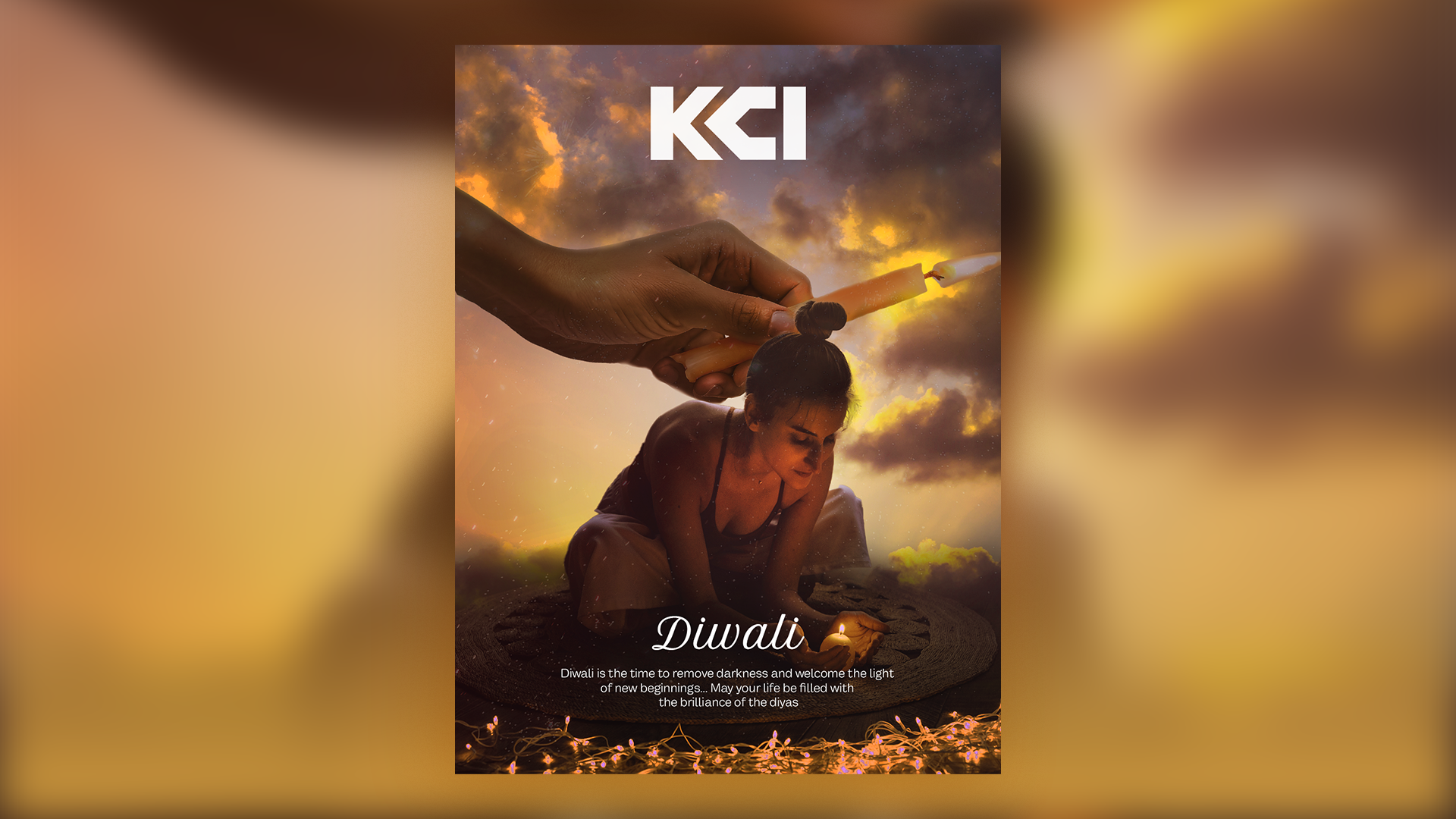
DIWALI POSTER DESIGN

DIWALI POSTER DESIGN

I designed this Diwali poster as a creative gift for my Hindu friends. The goal was to capture the festive spirit of Diwali through a modern, cinematic approach. I combined photo manipulation, lighting effects, and color grading to achieve a movie-style composition that feels both vibrant and emotional. Every element—from the glowing lamps to the subtle particle effects—was carefully crafted to symbolize light, celebration, and positivity. The final artwork blends tradition with contemporary visual design, creating a striking piece that celebrates culture through modern artistry.


HEINEKEN  / Logo Animation

HEINEKEN / Logo Animation


I started this Heineken logo animation by downloading the SVG from Brandmark.io. From there, I brought the concept to life — building the storyboard, crafting detailed styleframes, and pushing through every stage of animation and sound design. This project wasn’t just about movement; it was about testing my creative limits as a motion designer, turning a simple logo into something that feels alive and full of energy.


LIPACHAT  /OTP Authentication

LIPACHAT /OTP Authentication


The Lipachat project was an exciting journey from concept to final motion. After my client shared the vision and script, I took the lead in transforming words into visuals—building the storyboard, designing the styleframes, and bringing everything to life through animation and sound design. The story centered on how WhatsApp integrates with B2B services—allowing users to pay bills, settle loans, and shop seamlessly through WhatsApp prompts powered by SIM Toolkit. Every frame was crafted to capture that effortless flow of digital convenience, making technology feel simple, human, and connected.


LIPACHAT /Real Time Order Updates

LIPACHAT /Real Time Order Updates


The Lipachat project was an exciting journey from concept to final motion. After my client shared the vision and script, I took the lead in transforming words into visuals—building the storyboard, designing the styleframes, and bringing everything to life through animation and sound design. The story centered on how WhatsApp integrates with B2B services—allowing users to pay bills, settle loans, and shop seamlessly through WhatsApp prompts powered by SIM Toolkit. Every frame was crafted to capture that effortless flow of digital convenience, making technology feel simple, human, and connected.


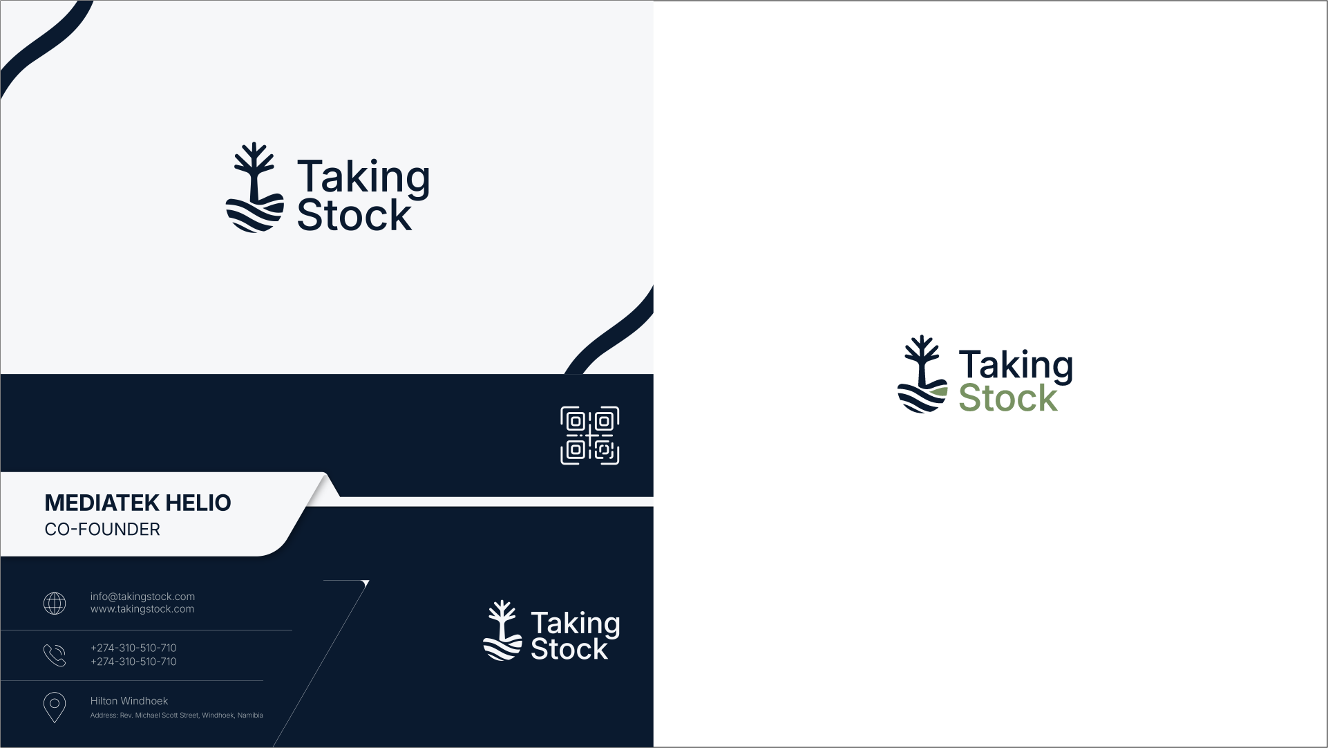
TAKING STOCK / Brand Identity Design

TAKING STOCK / Brand Identity Design

From the client’s initial idea, I developed the full brand identity for Taking Stock Namibia. The process began with multiple logo sketches, from which one standout concept was refined in Illustrator to achieve a bold, professional look. Once the logo was finalized, I designed the business cards—both front and back—integrating key details about the investment discussion venue for a cohesive and elegant brand presentation.